My Introduction to Oil Painting
I once heard that Van Gogh ate blue oil paint and started going insane, and for the longest time, that was enough to scare me away from oil painting.
Okay, not really—but Van Gogh did eat paint, by the way.
I was always intimidated by oils simply because I didn't know how to use them. I was never super interested in "wet" media or color theory. I was raised as a pen-and-ink artist and felt most comfortable in that world. But when one of my classes was canceled during my final semester of college, I had limited options to fill my last requirement—and it just so happened that an oil painting class fit perfectly into my schedule.
First Day
I had been in the painting room before, but only in passing. This was my first time actually taking a class there. In the center of the room sat a low table draped in fabric where still lifes would be arranged. Easels circled the table, and half the room was lined with windows. Air vents covered the ceiling, and I remember being slightly concerned about sitting in any of the chairs in case someone had left wet paint on them.
Class began with introductions. We went around the room sharing our names and previous experience with oil paints. To my surprise, only a handful of students had worked with oils before. Many of us admitted we'd avoided them because of concerns about fumes, but our instructor explained safe painting practices and how the classroom's ventilation system worked.
We learned the basics of oil painting, received our brush sets and palettes, and claimed our easels for the semester. Naturally, I picked a spot by the windows—which may or may not have been a good decision depending on the weather.
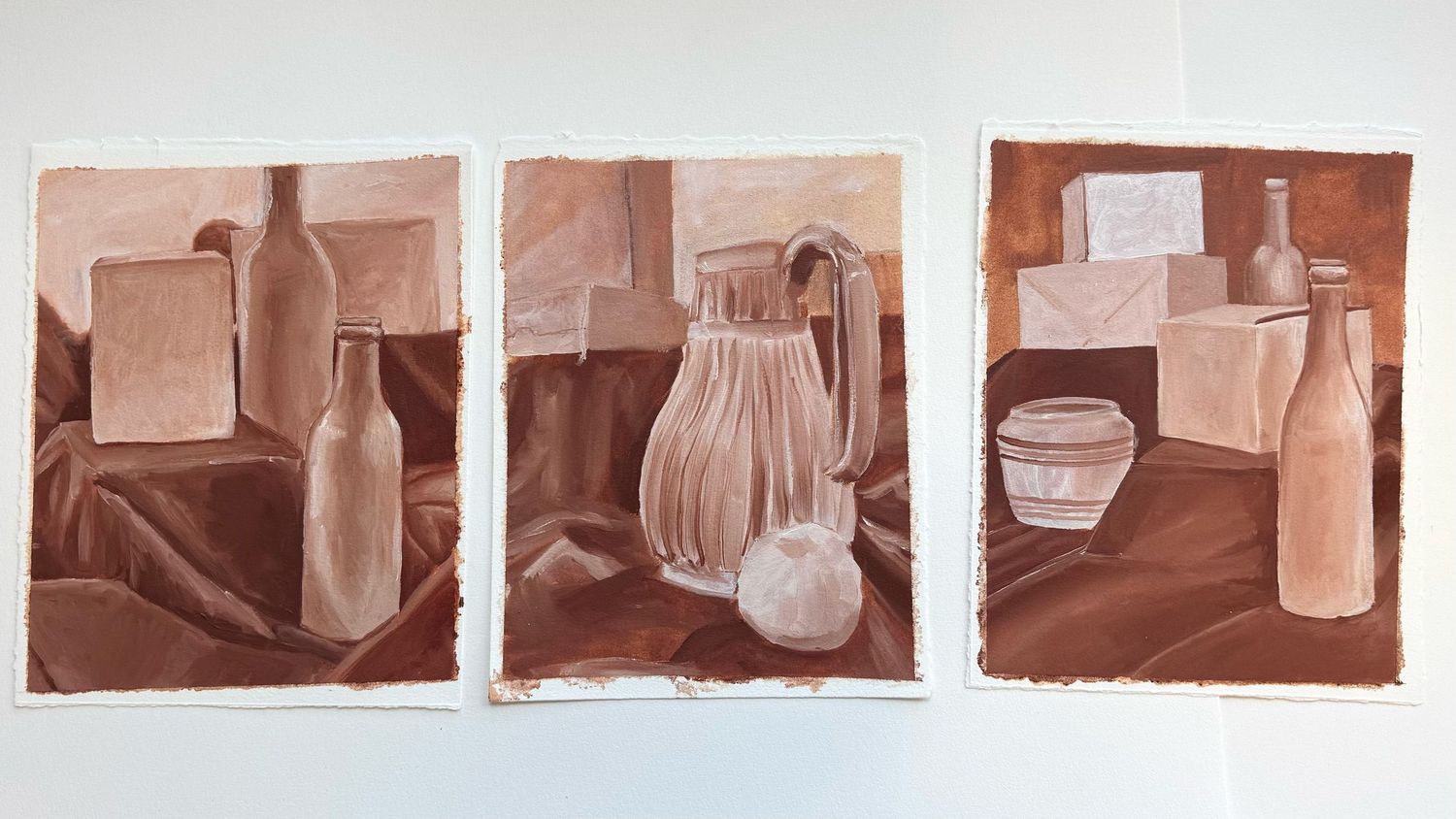
My First Underpainting
We wasted no time getting started. Our first project focused on underpainting and why it's such an important part of the process.
I was already familiar with the concept and was mostly excited about the possibility of using a bright, vibrant color like I'd seen artists do online. Unfortunately, we were limited to burnt sienna or burnt umber.
Brown. Possibly the most boring color on Earth.
Still, I was having a great time.
If you're unfamiliar with underpainting, it's meant to be a rough foundation that guides the rest of the painting. However, as a lifelong perfectionist who had way too much time on her hands, I went a little overboard. My "rough draft" ended up looking more like a finished monochromatic painting.
This would not be the last time that happened during the semester.
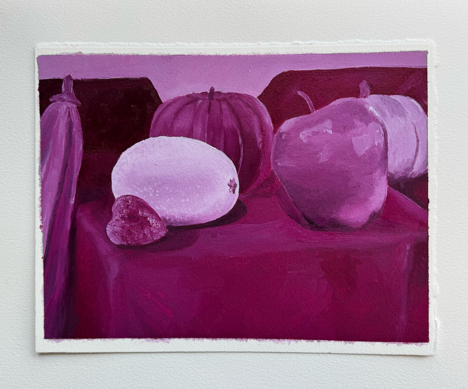
Underpaint Round Two: Pink!
Our second assignment focused on monochromatic painting—essentially another underpainting, but this time we could choose our own color.
Finally.
Obviously, I went with the brightest option available: magenta.
(Some classmates thought I chose it because it matched my hair. Maybe I did. Maybe I didn't.)
At this point, I was feeling pretty comfortable with oils. Nothing felt too far outside my comfort zone yet. I was still working with a single color, which meant I could focus on values, shadows, and highlights much like I did in my pen-and-ink work.
But I knew that comfort wouldn't last forever, especially with our next assignment quickly approaching.
The color wheel
I know, I know.
If you've taken an art class, you've probably made a color wheel. I've made what feels like a thousand of them, and they've never been particularly exciting. In fact, they're usually my least favorite part of any art course.
So when I learned we'd be making one with oils, I was already preparing myself for boredom.
At first, I thought, "Great. Another pointless assignment." But this ended up being the one time I was genuinely grateful to have a color wheel.
Oil paints and pigment mixing were completely foreign to me, and having a visual reference helped me understand exactly how colors interacted. It became an invaluable tool throughout the rest of the semester as we dove headfirst into color theory.
Color Theory: Complementary Colors
Assignment: Using only complementary colors, combine an origami figure with either a realistic or imaginative background.
Sounds easy enough, right?
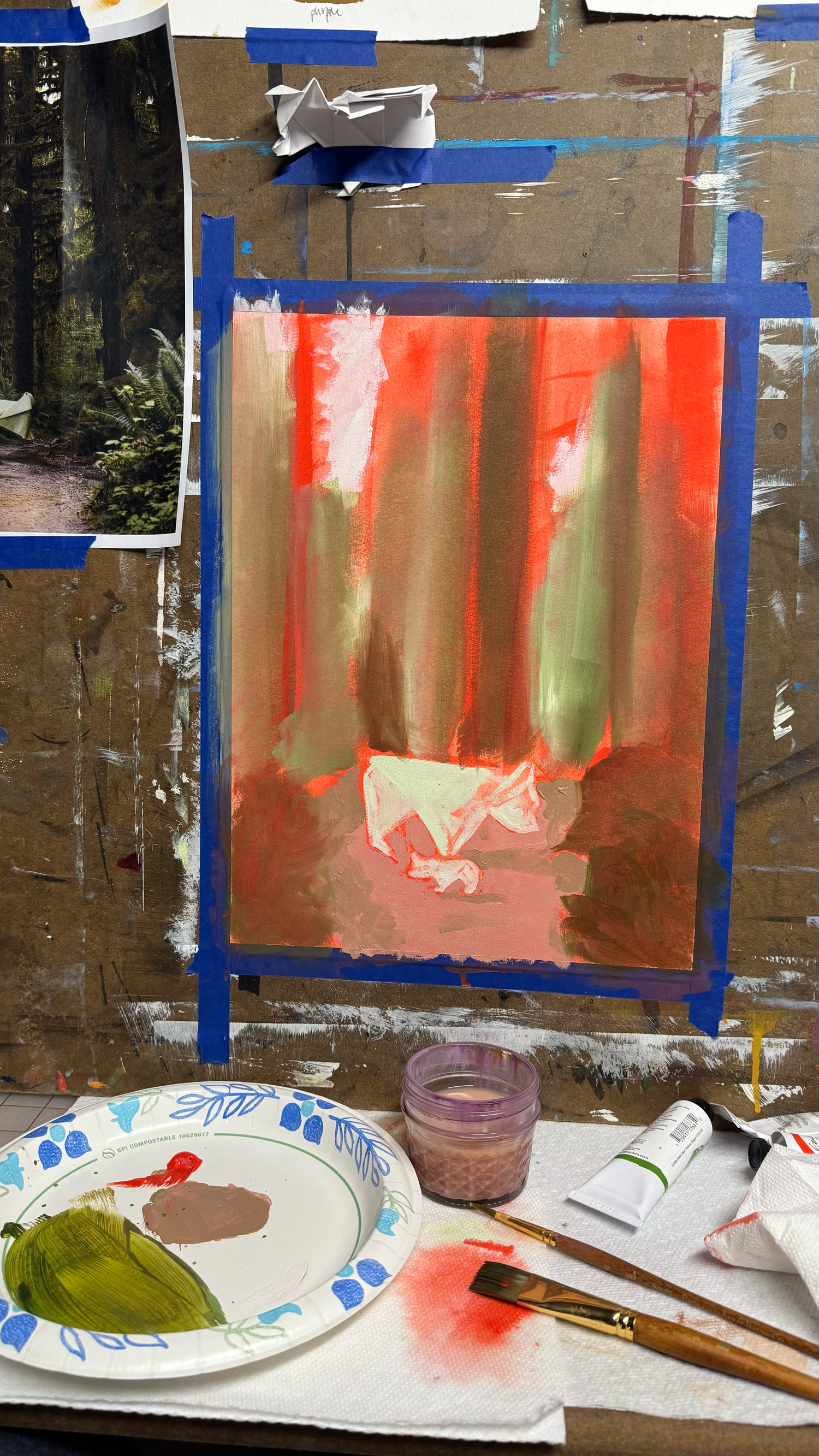
Well, unless you're me and decide to make things significantly harder than necessary. The assignment technically called for an origami boat placed into a scene. Naturally, I ignored that suggestion and folded an origami bear instead. I paired it with a landscape reference from one of my trips to Hoh Rain Forest National Park.
It was always important to me that as much of my work as possible came from my own references. If I could use my own photographs, then the final piece felt completely mine.
And, if it wasn't already obvious, I chose red and green as my complementary colors.
This time I tried to keep my underpainting a little looser so I wouldn't spend all my time refining a layer that would eventually be covered up anyway. It was my first attempt at rendering such a dense and detailed environment, and honestly, I didn't have much of a strategy.
I was mostly winging it.
I experimented with different brushes, textures, and mark-making techniques. If something didn't work, I simply painted over it and tried again. That became one of my favorite things about oils—the freedom to adjust and keep moving forward.
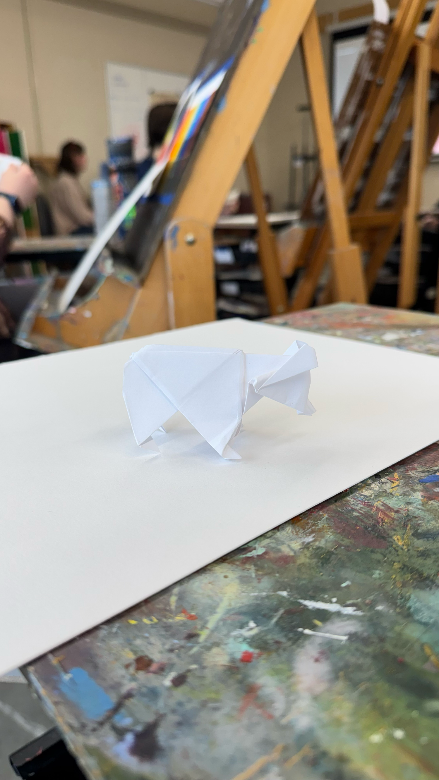


Reference image I made in Photoshop combining my origami & photography
Landscape
Before beginning our landscape project, we researched various artists and studied how they approached the subject in their own unique styles.
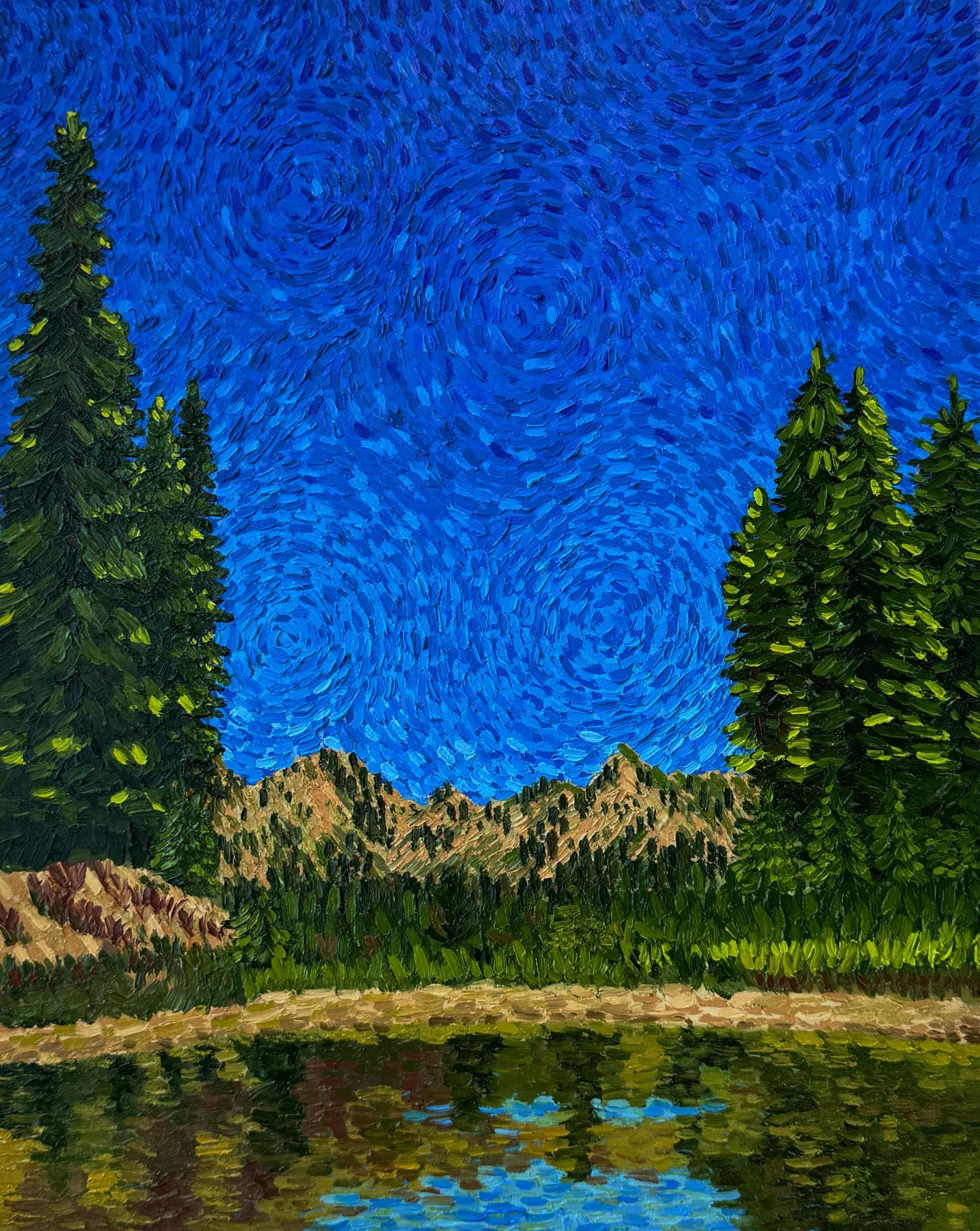
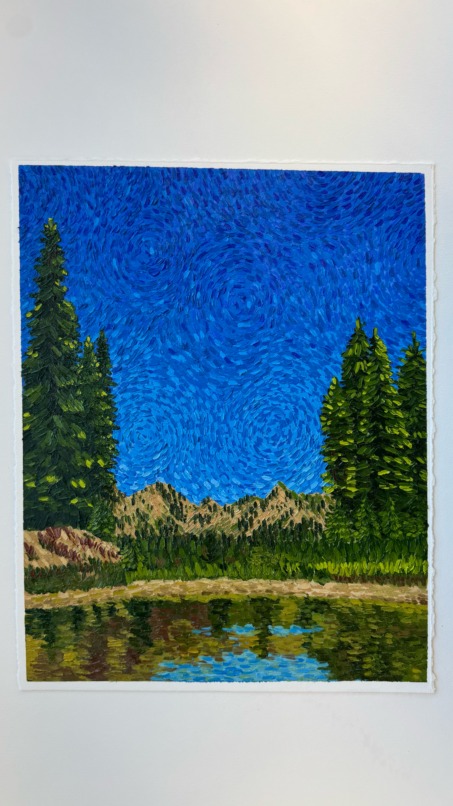
I had already experimented with realism, so I thought it would be fun to do a complete 180 and try something more impressionistic.
I've always loved artists like Seurat, Van Gogh, and Monet. The way carefully placed strokes and colors blend together from a distance has always fascinated me. After a recent visit to the Art Institute of Chicago, I became even more interested in the texture that often accompanies those styles.
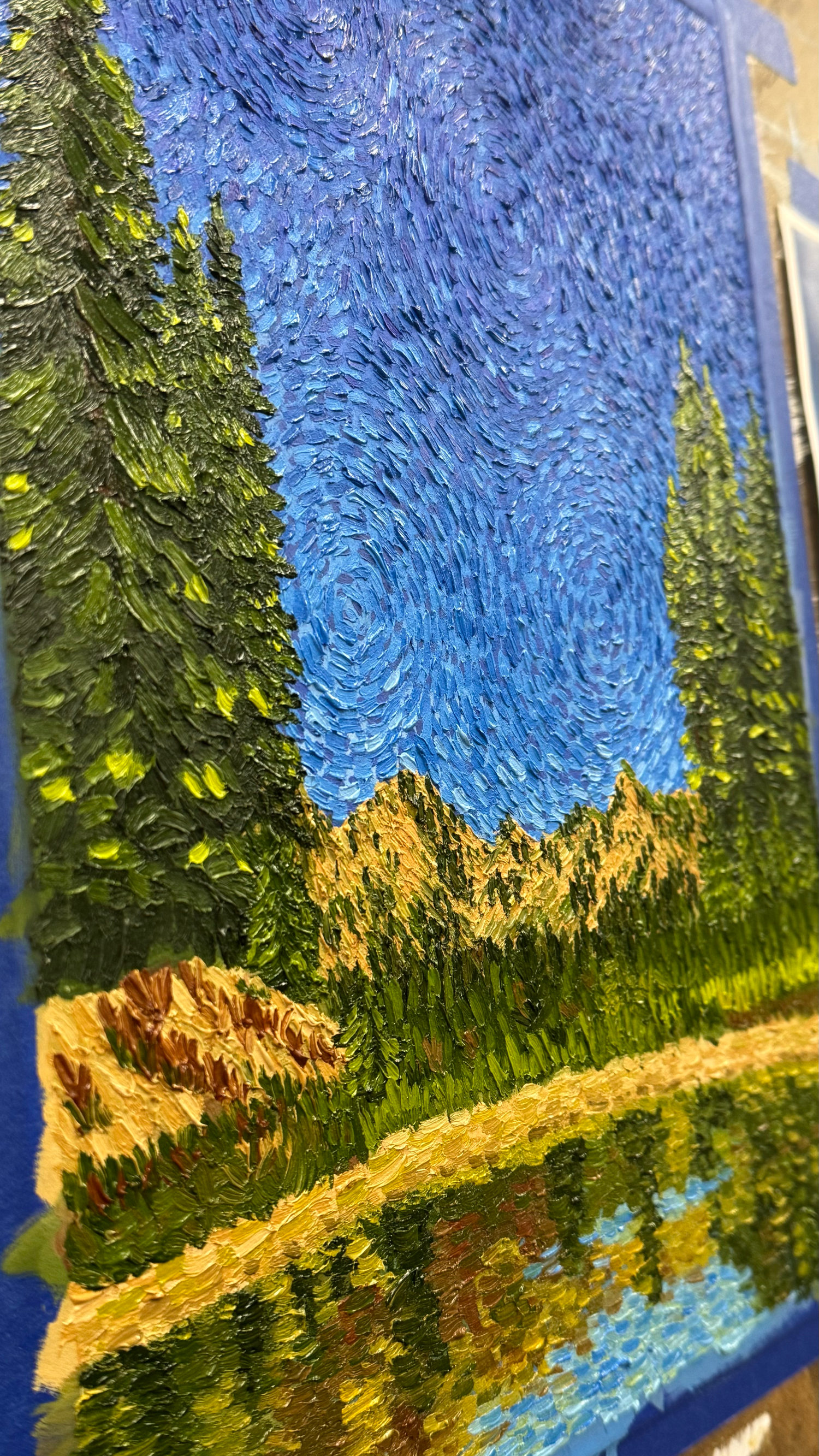
A little research led me to the technique known as impasto—the thick, textured application of paint famously used by artists like Van Gogh and Monet.
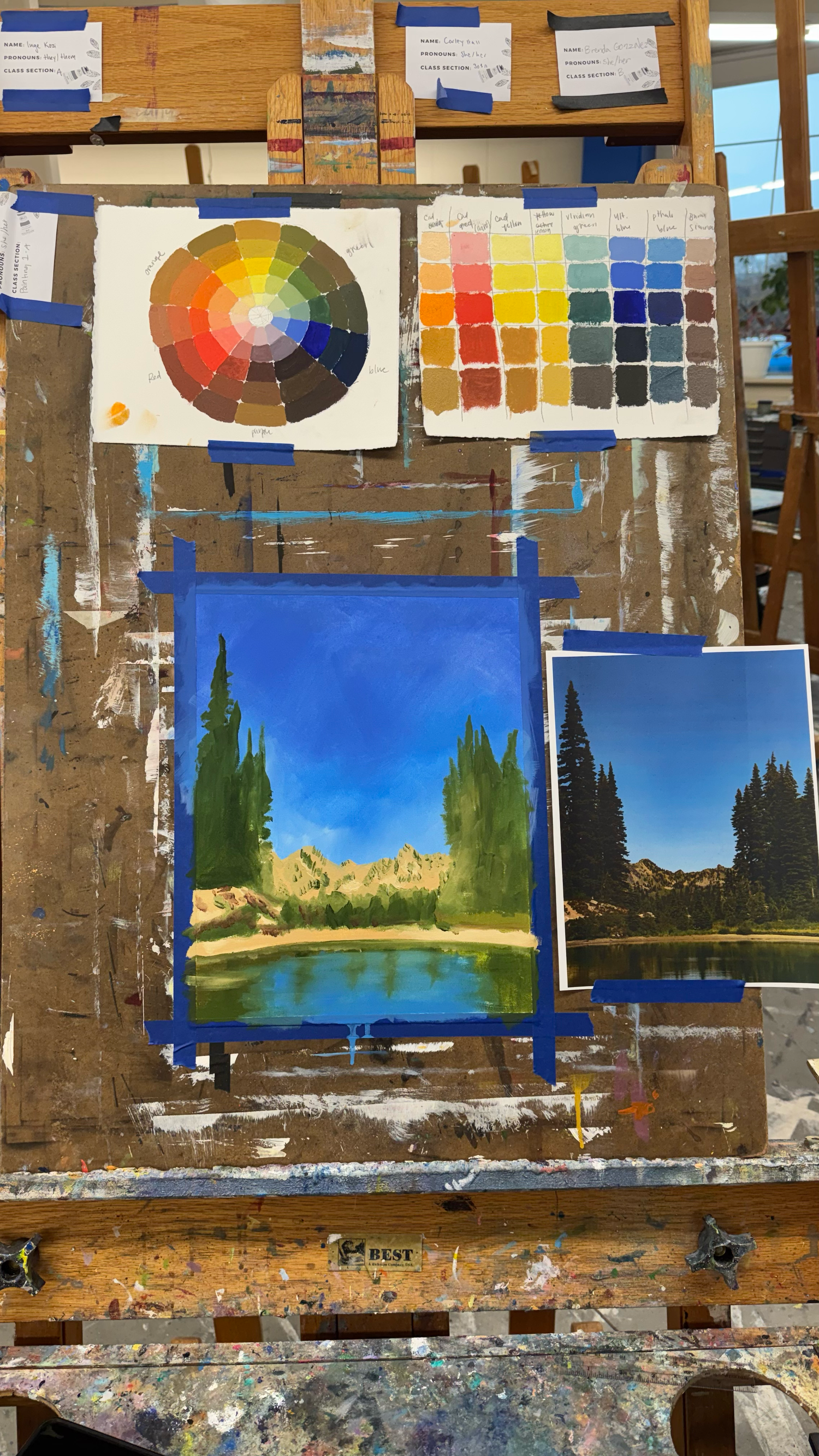
For my project, I chose a landscape photograph I had taken on a trail in Mount Rainier National Park. I figured that with scenery that beautiful, even a mediocre painting would still turn out pretty nice.
Having never worked in this style before, I wasn't entirely sure where to start. Eventually, I realized the only option was to dive in and hope for the best.
The process was slow at first as I adjusted to the technique. I focused on the direction of my brushstrokes and making sure I loaded enough paint onto the brush. Little by little, I learned how to work with the paint instead of fighting against it. I began to understand how to manage the long drying times and use the wetness of the medium to my advantage.
Tackling Canvas
Up until this point, we'd been working on oil paper. While I enjoyed it, I was excited to finally paint on a canvas.
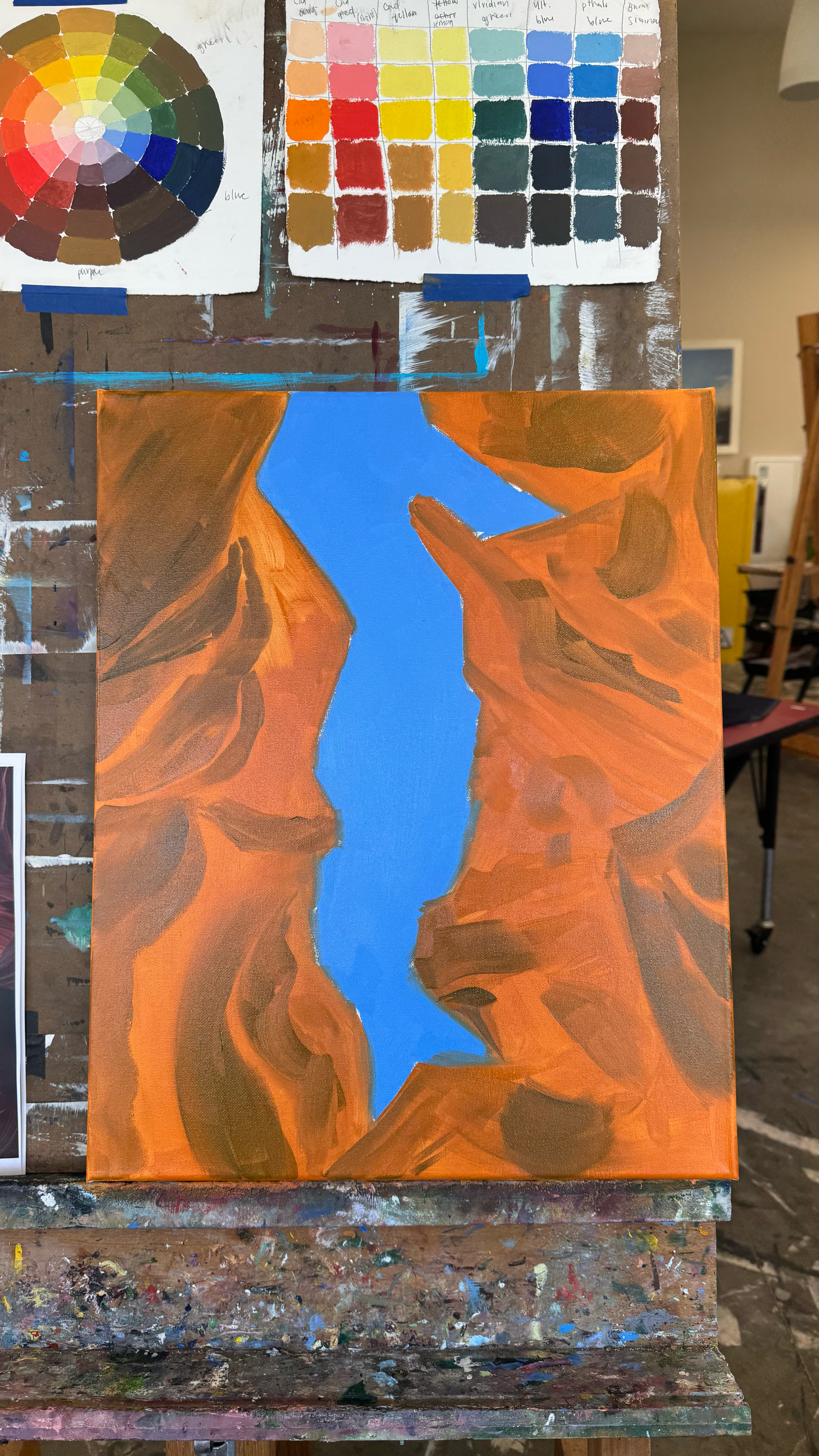
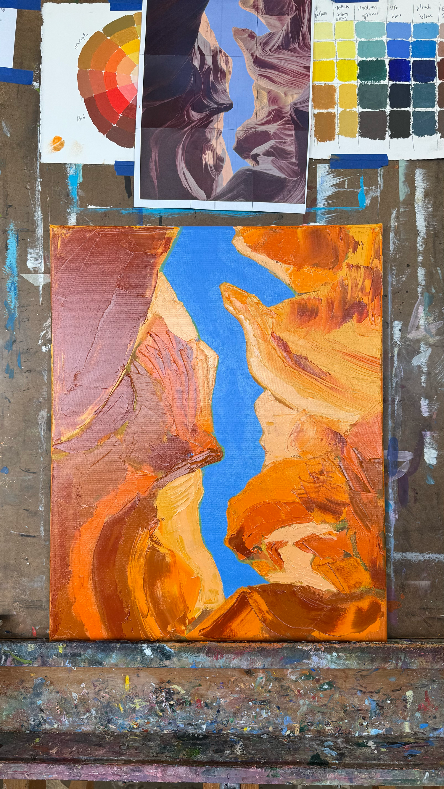
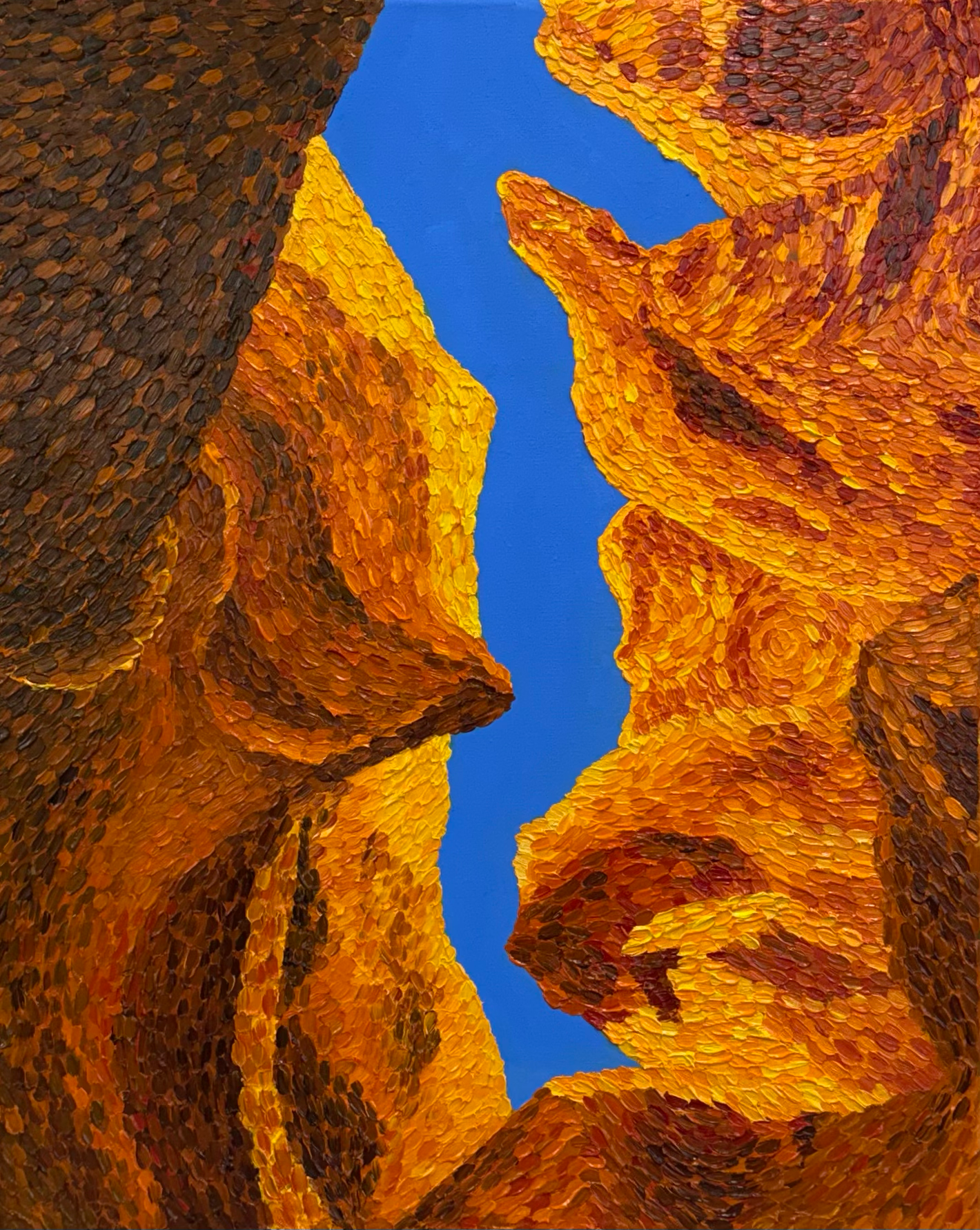
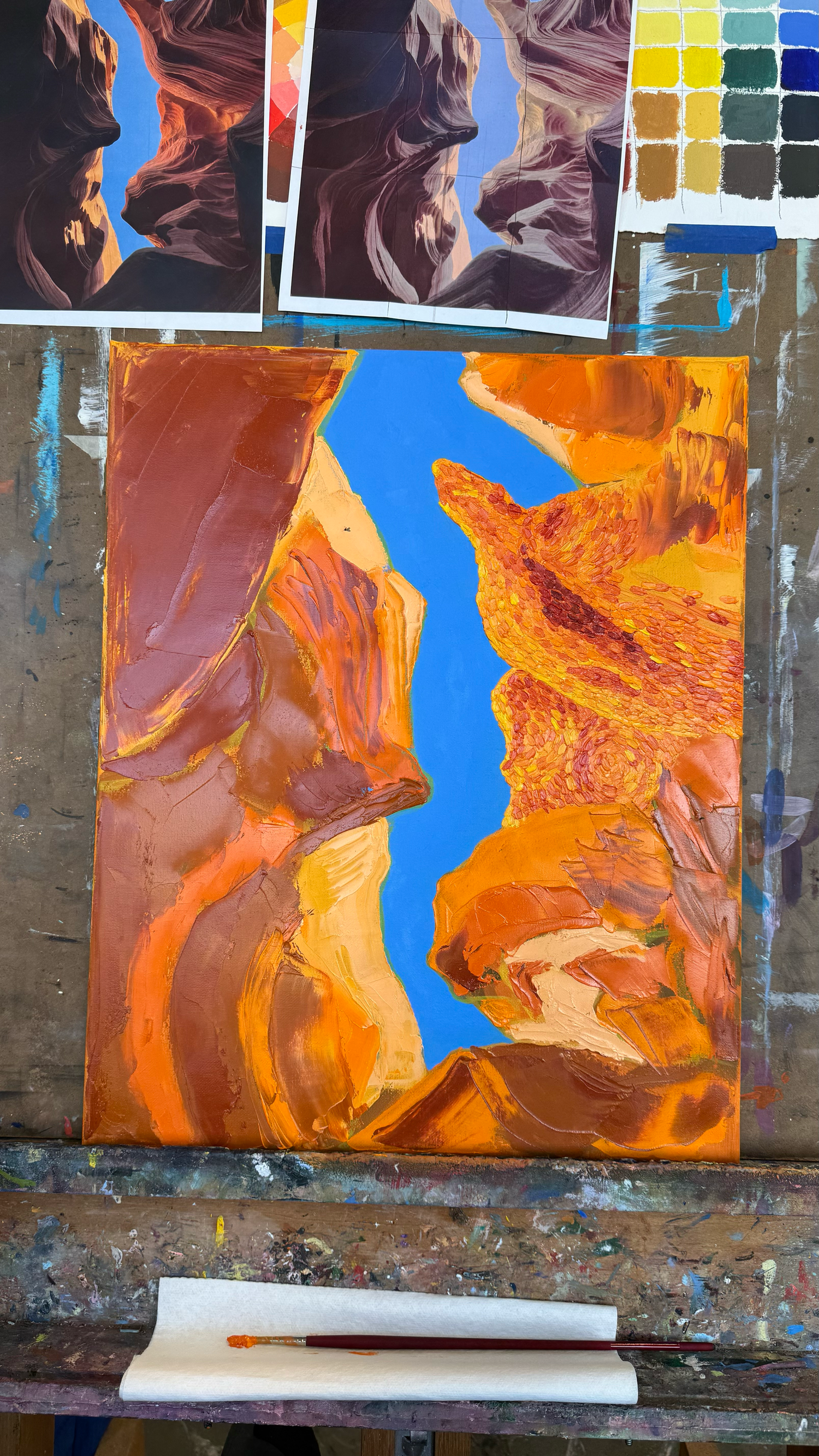
Our final project was fairly open-ended. Once again, I chose a landscape, but this time from a completely different environment. Using one of my photographs from Lower Antelope Canyon in Arizona, I decided to revisit the impasto technique.
The flowing rock formations and subtle shifts in color felt like the perfect opportunity to push the style further. I also wanted to be bolder with my color choices and create something that felt energetic and expressive.
Painting on canvas was a fun shift. It felt easier to build up thick layers of paint without the surface absorbing as much of it. Of course, working larger also meant there were moments when it felt like the painting would never be finished.
(Spoiler alert: it got finished.)
This time, I started to understand impasto more naturally. I allowed colors to blend and interact directly on the canvas, and many of my brushstrokes contained multiple colors at once. Letting go of some control gave the painting more movement, energy, and fluidity.
Final Thoughts
Oil painting has changed the way I look at other aspects of my creative work as well. I find myself paying much closer attention to color and how even the smallest shift can completely change the mood of a piece. It's also given me a greater appreciation for texture and the role it plays in creating visual interest. Even in a two-dimensional space, texture can bring energy, movement, and personality to a piece in ways that are easy to overlook.
Long story short: I love oils.
I never would have guessed a million years ago that I would enjoy oil painting this much. It feels like an entirely new creative world has opened up to me. While oil painting certainly comes with its challenges, they're challenges I genuinely enjoy tackling. Every project teaches me something new, and I'm excited to keep learning.
I've even already had friends and family commission paintings from me.
So I guess the next step in this journey is building a proper studio setup—and, of course, buying more paints and brushes.